Case Study
Mobile Bank Application for Seniors
Redesigning a banking app for elderly users
Challenge
AllOne Bank was not built for older users
NH Bank's app, AllOne Bank, was not built with older users in mind. We analyzed the app's UX and redesigned it for elderly users. Behind the redesign sat bigger questions for the bank: what online experience to offer in the digital transformation era, how to engage customers across all age groups, and how to refresh an outdated brand image.
Results
A redesign in three directions
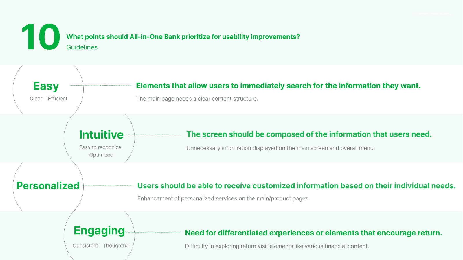
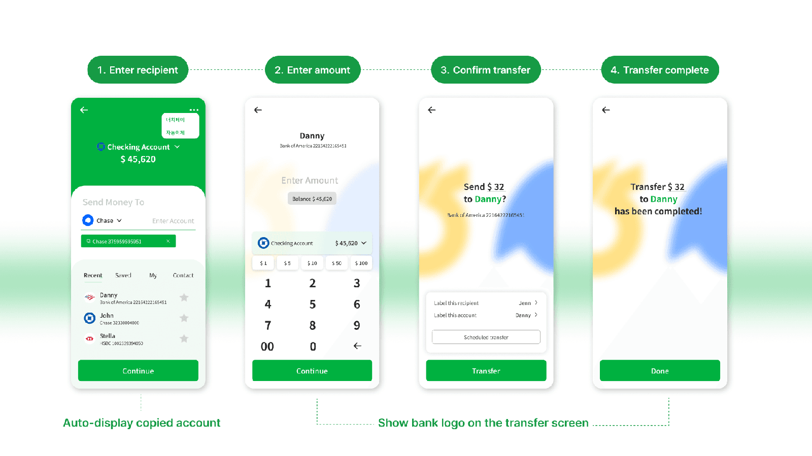
The redesign focused on three directions: overwhelming convenience, age-based hyper-personalization through feature customization, and improving the bank's outdated image. We validated the design with usability testing and used the findings to refine it further.
My impact
Leading the research and the design team
- Led a team of four UX designers
- Led the user research and analysis
- Ideated the design concepts and UX strategy
- Developed the design system and built the high-fidelity prototype
Process
From heuristic evaluation to usability testing
Desk Research
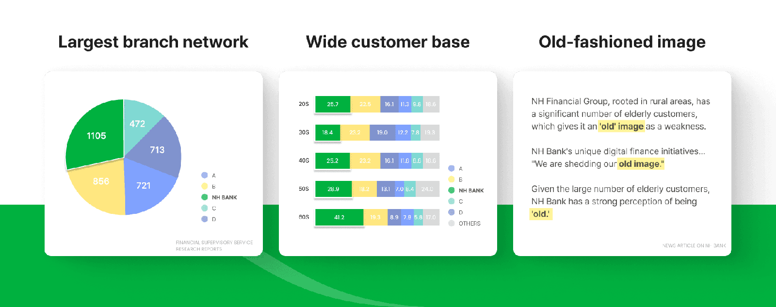
I analyzed NH Bank's position against other banks: branch network, main user demographics, and brand image. This gave us the market context we needed before analyzing users.
Heuristic Evaluation
I evaluated the usability of five fintech services (Kakao Bank, Shinhan SuperSOL, CoK Bank, Toss, and Industrial Bank of Korea) across three screens: the main screen, the financial services screen, and the menu. The services were chosen from in-depth interview results, competitor references, and the desk research.
Our Solution
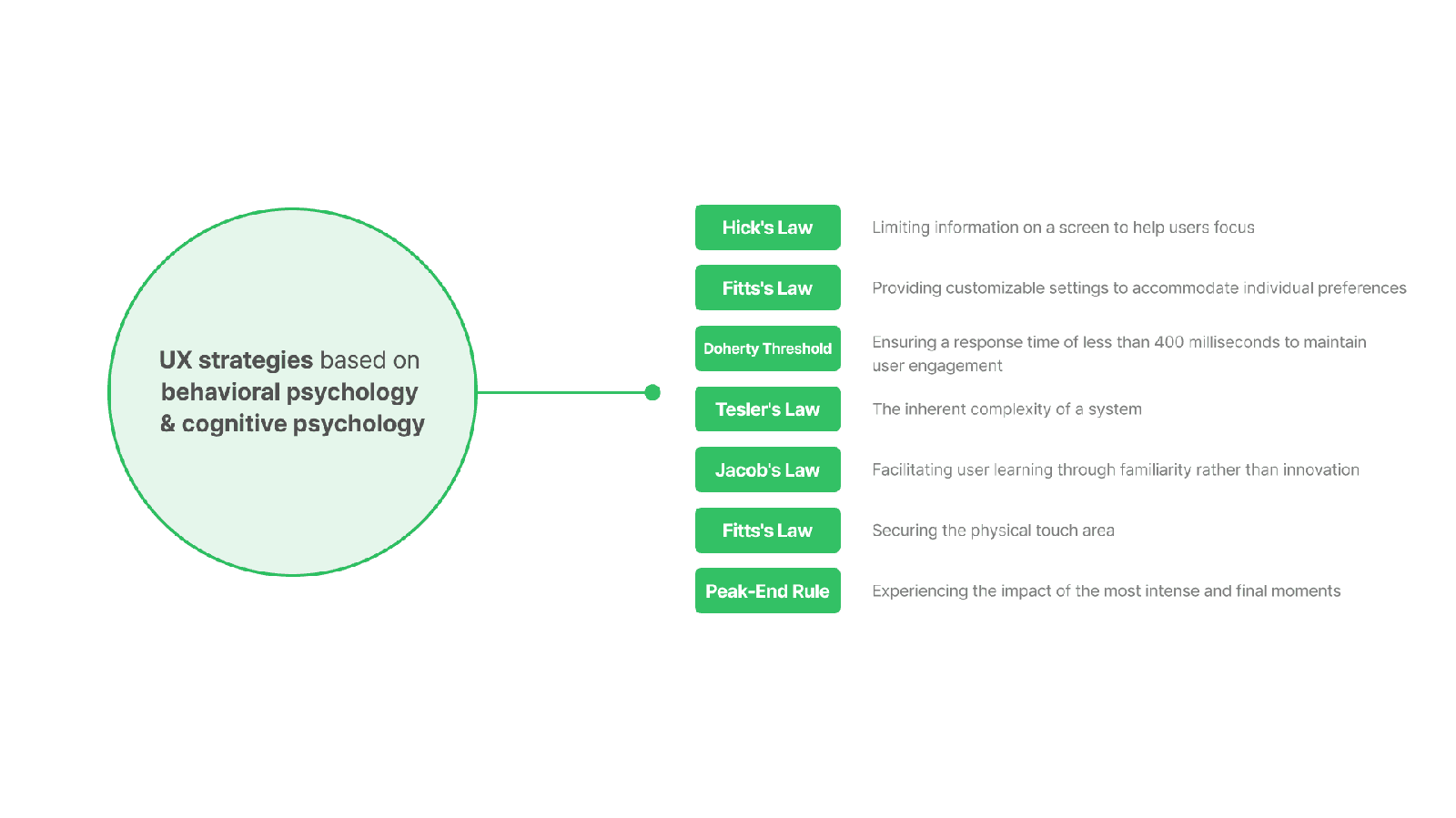
We derived UX strategies from behavioral and cognitive psychology. The goal was a digital experience that makes tasks faster and less error-prone for older users, built around convenience, age-based personalization, and a fresher brand image.
Usability Testing
We ran the test over Zoom screen sharing using Maze, with a moderator, a note-taker, and an interviewer. I was the interviewer. We observed interactions in real time and organized participants' responses and actions by flow and step to identify where to improve.
Retrospective
Accessibility shaped every decision
Designing for older users made the work concrete. Accessibility was not a checklist at the end; it shaped every decision from the start. The project strengthened my commitment to accessible, socially responsible design, and it still grounds how I approach human-centered design.