Case Study
Naver Pay QR Payment
Boosting offline adoption through personalized benefits
Challenge
Strong online, barely used offline
Naver Pay is the fintech app from Naver, South Korea's largest web portal. It is widely used for online payments but much less so offline. Users could not easily find the benefits the app offered, which held back new user adoption. The app also had no real personalization, so there was little reason for new users to stay.
Results
Benefits people could finally find
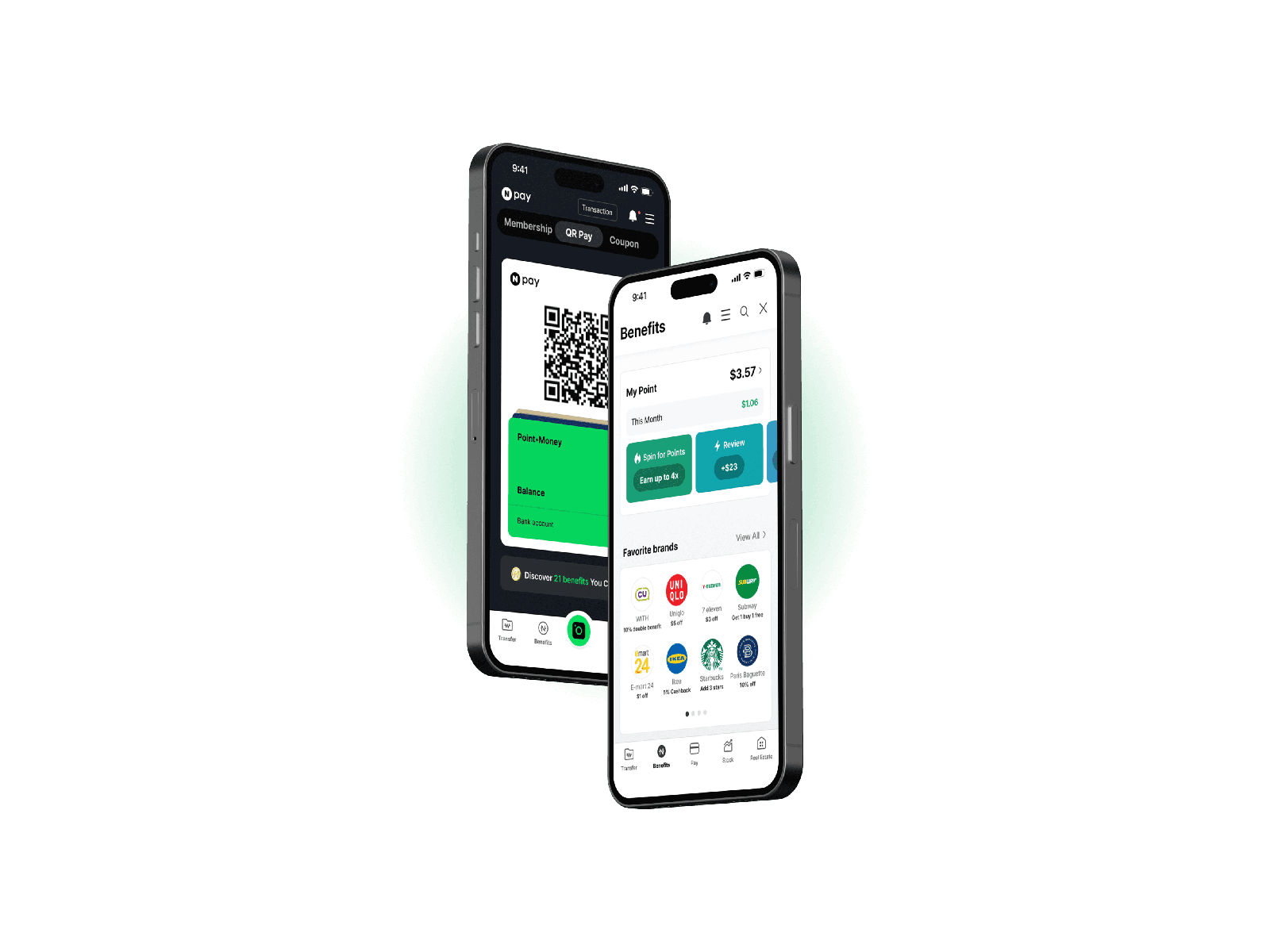
The redesign cleaned up the interface and made personalized benefits easier to reach. Improved banners on the main page raised information awareness by 75%. Adding personalization options raised the opt-in rate for benefits by 57.1%.
My impact
Leading the UX/UI team end to end
- Led the UX/UI team as team leader, driving insight discovery
- Built interactive prototypes and ran usability tests to compare design solutions
- Designed the end-to-end user journey, focusing on navigation and engagement
- Ran the user research: analyzed target audience behavior to find needs and pain points
- Built a unified design system and visual language for a consistent interface
Process
From keyword analysis to two tested concepts
Discover
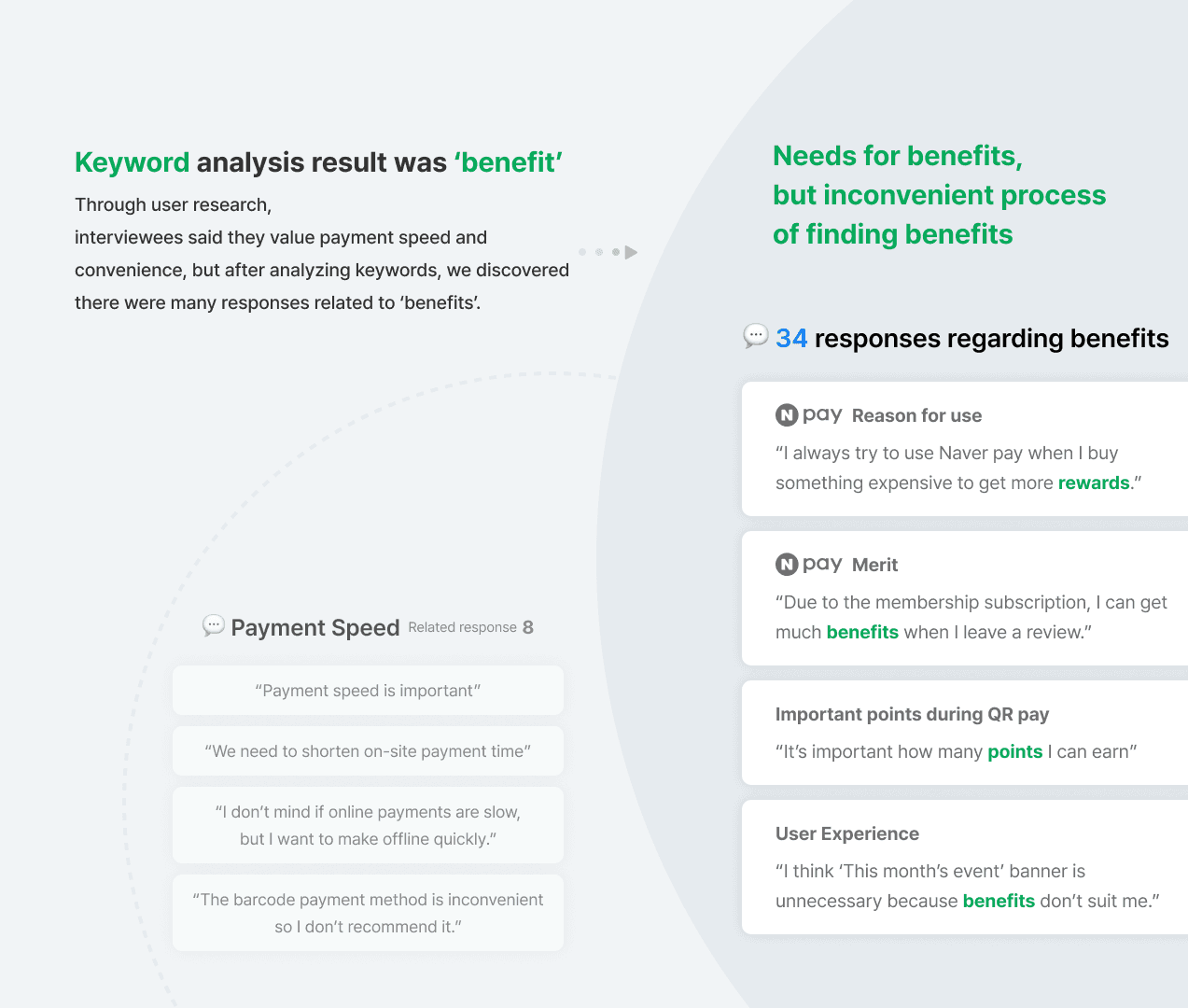
Through surveys and interviews, we found that 20% of users chose Naver Pay for its benefits and rewards, yet many could not find the right ones. We documented every finding and grouped quotes and insights by the flow and step each user was in.
Mapping the Journey
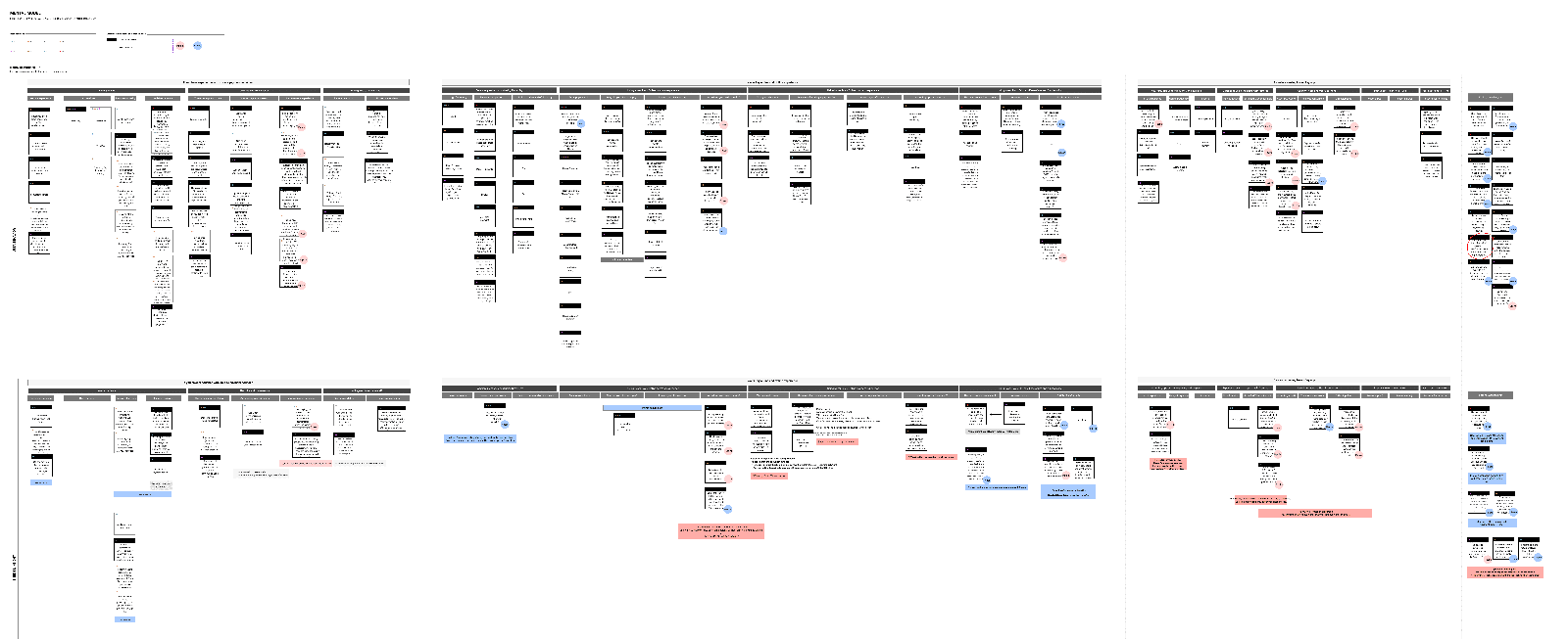
From the interviews and background research, we built a journey map of paying by QR code in the app. Walking through it showed us where problems were likely to appear. We focused on convenience for essential tasks done outside the home.
Define
We set OKRs for the project: grow monthly active users by 20% among new users paying offline, get first-time offline users to return for a second payment within a month, and reach a 10% first-transaction conversion rate. The target audience was people who knew Naver Pay but had not yet used the app.
Solution
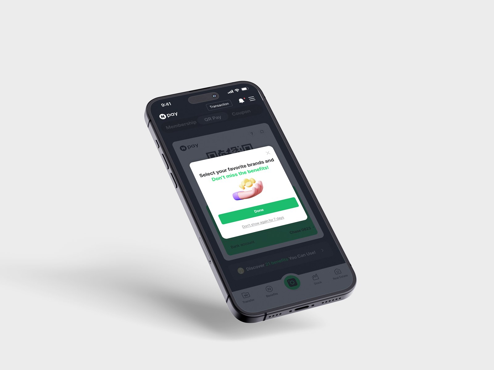
The concept: let users select their preferences, such as favorite brands and categories, without feeling they were handing over personal information, and make it enjoyable. We used perceived control and intrinsic motivation so the interface gave users a sense of autonomy, which reduced privacy concerns.
Two Concepts
Option 1, Selection: an onboarding flow where users see merchants at a glance and pick brands by category. The risk was that rushing through three selections would weaken personalization. Option 2, Gamification: game-like elements that make users less aware they are sharing data. The risk there was repetition: the more categories chosen, the more tedious brand selection became.
User Testing
We ran usability testing sessions with think-aloud protocols, asking participants to talk through their reactions, expectations, and decisions. The goal was to learn how users perceived the different onboarding flows for personalized, made-for-you benefits.

Retrospective
Exploring broadly instead of deeply
This project pushed me to explore broadly rather than deeply, and to look for different ways to add value for users. Running the interviews taught me how to draw out fuller responses and make interviewees comfortable. I also came away with a clearer understanding of how design decisions shape product strategy.